Thursday, 5 October 2023

Magazine Research

Here is my preliminary research for my magazine


Magazines On Shelves


After a quick analysis of the magazines displayed, what I learnt is that the top of a magazine cover is essential in grabbing the audience's attention. The top of a magazine cover is where the audience's eyes will first glance, so magazines would put the title or name of the company to quickly tell the audience what it might be about. Audiences also read from left to right (in the English language) so the left third of a magazine will also be an important aspect in the design of the magazine. Furthermore, the people looking at the magazines would look at what is in their eye level, so people who sell magazines put the magazine genre based on their audience - for example, a child's colouring magazine is placed at the bottom where it is at level with their eyes. 

Reflection
This research showed me the importance of the upper section and the left third of a magazine cover, knowing this - I would consider and plan these aspects when designing my cover, as it helps produce a more effective magazine cover. This research has allowed me to think more in-depth through the vision of companies and would help me to produce magazines similarly to how they would do it.

Reflection
After understanding the uses of each component that goes into designing a cover, I think the main cover of a magazine is one of the most crucial parts of designing a magazine as it represents the identity of the magazine. From this research, I learned that I must design the cover more carefully - making sure I select the correct components for the cover so that I'll have a good-looking magazine. 

2 Detailed Analysis + 4 Mini Analysis

Reflection
Initially, I wanted to make a cultural travel, architectural travel or food-travel magazine because I liked being able to discover and design multiple genres. However, after looking more into and doing more research - I have decided to do only travel magazines for my main project so I would be able to focus more on the travel conventions and the content.

From these magazine covers and double-spread pages analysis, I think I have found my preferences towards the design and layout of magazine types. I also analyzed how different genres of magazines affect what content will be displayed on them. Overall, I find it really interesting to look at the details towards different magazine genres. I think this research may help me decide on which magazine genre I would like to focus on. I would continue to look out for and analyse any magazine I would come across. 

https://issuu.com/luxurytravelmag/docs/summer_2019 

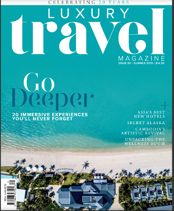
Luxury Travel, Issue 80 - Summer 2019

Indesign Media Group

Masthead/Title

What does it literally mean? What does it suggest?


The title, ‘Luxury Travels’ means a posh/grand vacation. This title suggests that the magazine would discuss places to visit so that people could experience a high-end vacation.

Typography

What mood, tone, or attitude is suggested by the text's size, shape, colour, and positioning? 


The typography used to display the word ‘luxury’ in the title is an elegant thick serif. The typography has an elegant and formal look, making it look luxurious - which is suited to the word luxury. This word is bolded, being the largest word in the top centre of the magazine so that the word luxury would stand out and be the first thing the audience sees; catching their attention. This typography was also in the cover lines’ text - suggesting that the contents of the magazine would be filled with locations that are luxurious for people to visit. The rest of the text uses a sans serif, geometric typeface which has a clean, modern and minimalistic aesthetic that makes the text look professional and elegant.


The text was almost all written in white; this further creates a simple and minimalistic look; as the white text does not contrast too much with the image and is not hard to read.


I enjoy the looks of the typography used for the title of this magazine, which was a sans-serif geometric typeface; it is easy to read and looks professional. Furthermore; in magazines where the images are dominant - I can see that the title will mostly be written in large, white and bold text. I might use these conventions in my magazine. 

Image

What has been selected for the cover? How has it been lit? What camera angle has been used? How has the subject been posed? How are they dressed? 


The image used for the cover of this magazine was a long-shot top-view of a beachside. The image is composed of a large building (at the bottom of the image) surrounded by greenery and palm trees - with a crystal-clear blue ocean in front of it. The subject was made to look relaxing and mesmerizing. The image may be an example of a tourist destination; this picture further enhances the theme of a luxurious vacation.


I would try to include a good quality image that would suit the title of my magazine; the image I will use will be dominant on the cover as I am planning to make a travel magazine. 

Language

What is the strapline? What does it suggest about the magazine and the reader? What rhetorical features are evident on the cover?


This magazine has the cover line 20 immersive experiences you’ll never forget, This is a slogan that suggests that the content inside this magazine will show the best attractions for the reader that they must visit. It is effective and persuasive making people who want to travel interested in this magazine. The cover also has coverlines which are mini-detailed descriptions of destinations for tourists to visit. The locations were described using adjectives like ‘secret’ and ‘best’, which piques the interest of the reader - making them want to buy this magazine. 

Representation

To what extent does the image conform to the conventional representations of men/women/celebrities?  


This magazine conforms to almost all of the typical conventions of tourist interest. The main cover shows an image of a relaxing beachside with a stunning ocean; the location overall looks pleasing and this is what usually attracts people who want to travel. They would want to see the attractive and gorgeous images of the locations before they go there, further conforming to the conventions. 


If I were to make a magazine about travelling, I would probably also follow these conventions so that I could effectively attract and target the people who want to travel. 

Adverts

What kind of products/services (ads) tend to be featured in this type of magazine?


Because this is a travel magazine; advertisements that would appear would usually be related to travelling or the destination. For example: luggage advertisements for 

travelling; and sunscreen for destinations in a warmer climate.  


https://issuu.com/indesigngroup/docs/adq1-onlinemag_lowres 

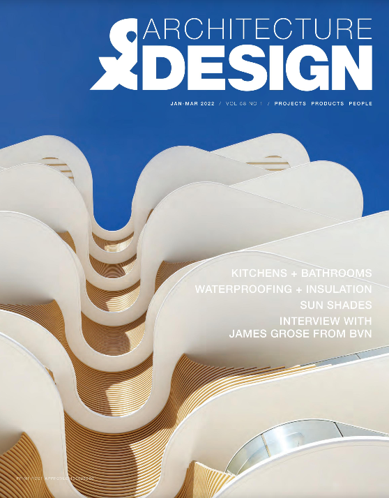
Architecture & Design, Vol 58 no. 1, February - April 2022

https://www.architectureanddesign.com.au/home 

Masthead/Title

What does it literally mean? What does it suggest?


The title ‘Architecture&Design’ has a self-explanatory meaning; the magazine would discuss ideas for buildings and interior designs. 

Typography

What mood, tone, or attitude is suggested by the text's size, shape, colour, and positioning? 


The typography used to display the text is a grotesque sans serif typeface. This typeface looks modern and professional which also improves the looks of credibility of this magazine cover, making it look more appealing for the readers who are usually working and interested in this category (architecture).  The title was split into two different fonts; one word used a very thin font and the other word used a bolded, thick font. This was done intentionally so that the bolded word ‘design’ would stand out on the title more; where the reader could see that this magazine would talk about designs for architecture and others that are related. The title is positioned top right and does not take up the whole space making it look neat - furthermore, the text was all in white which does not contrast or stand out too much from the image; keeping the minimalist aesthetic. 

Image

What has been selected for the cover? How has it been lit? What camera angle has been used? How has the subject been posed? How are they dressed? 


The image shown on the cover shows a building in a non-industrial shape - making it look more sleek, modern and elegant, showing that is well designed and relates to the topic of architectural designs. The building in the image is shown at a low angle; making it look more grand and powerful, which shows the reader that it is a good design. It is also lit bright at day; which makes the building stand out more from the sky and overall more appealing. The picture of the building here was the most dominant. This can be proven as we read from left to right, the left side of the cover has no text - showing that the image was the main focus. This building would be the first thing people would look at in the magazine; along with the effectiveness of the angle and lighting - it makes readers more interested in purchasing this magazine. 


The research here helps me show a lot of aspects I must think of before making my cover; such as how I am gonna take my image picture, where I am positioning it and how it should and would look. The picture here shows how important it is to plan these aspects before making the cover. 

Language

What is the strapline? What does it suggest about the magazine and the reader? What rhetorical features are evident on the cover?


This magazine has a cover line that mentions essential components of buildings. This implies that, as a design magazine, it will discuss ideas and ways to design these components so that they look appealing. One of the cover lines also mentions an interview with a person from a popular architecture firm in Australia. This suggests that it includes important content that people who are working and interested in architecture would want to see. The cover does not have persuasive features; this is justified as people don’t usually buy these magazines unless they are the niche that is targeted. Mostly people who are interested and working in the architectural industry would be the only ones purchasing it. 

Representation

To what extent does the image conform to the conventional representations of men/women/celebrities?  


Design magazines target designers, and to do this they usually follow conventions such as eye-catching covers, are minimalistic and high-quality images. They made the image the focus of the cover and limited the amount of text on the front cover. This magazine conforms to these conventions so that they could attract the designers and architects in the audience. 


This magazine however subverts to the typical magazine conventions, having no straplines so that it could look as minimalist and simple as possible. 


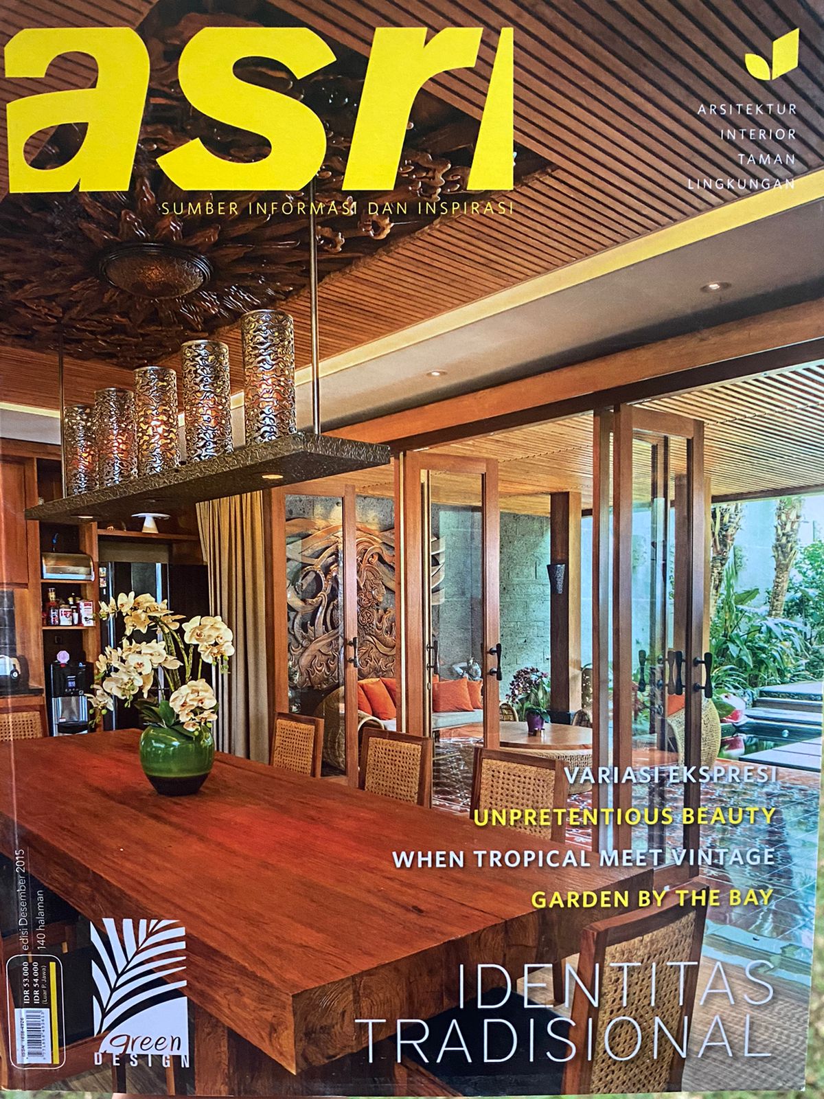
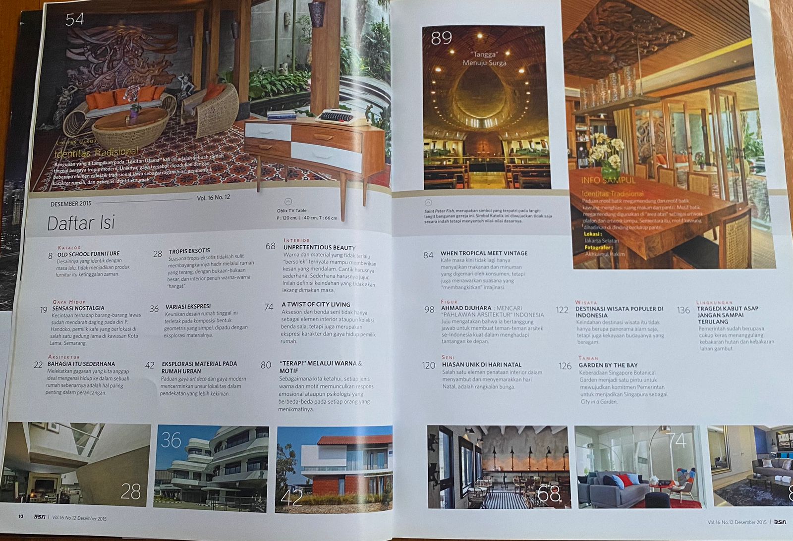
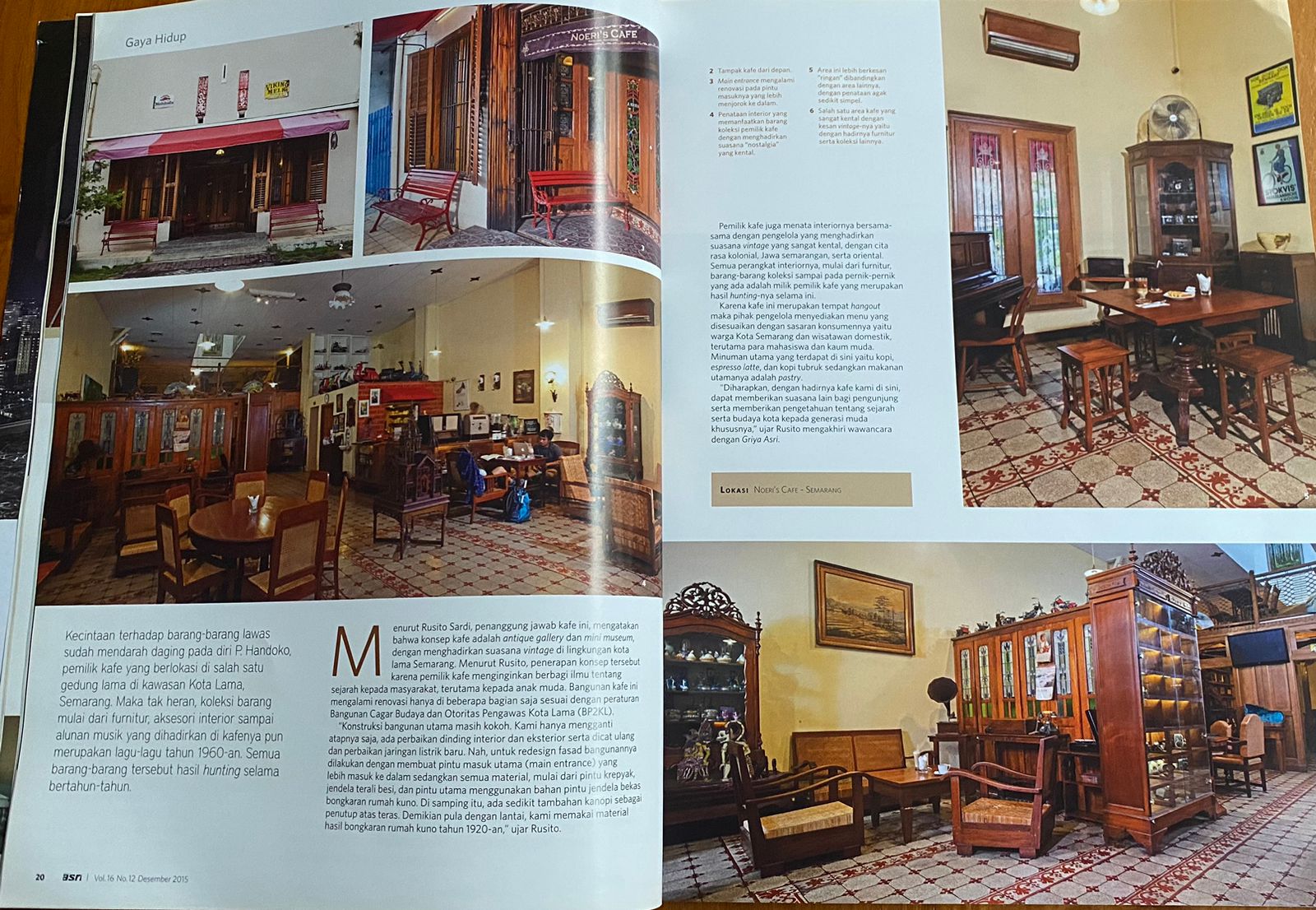
This is an Indonesian magazine that discusses and shows traditional interior design targeting people who might want to redesign their homes and people interested in interior design. I don’t like the way the title and text on the cover use the colour yellow - which blends in with the main image on the cover. This makes it hard to read, and the bright-coloured yellow looks out of place compared to the colour palette in the main image; therefore I would try to avoid this mistake in my own magazine. The does use white space to separate images and texts from top to bottom; however, it looks like the producers have overused the whitespace in the double page spread making the spaces look uneven from both pages - this too I would try to avoid. However; I enjoyed looking at the use of the colour palette throughout the magazine's contents. This shows a clear traditional theme, and therefore I would try to follow a good colour palette. 


https://issuu.com/indesigngroup/docs/lt-67-online-mag?utm_medium=referral&utm_source=www.architectureanddesign.com.au 


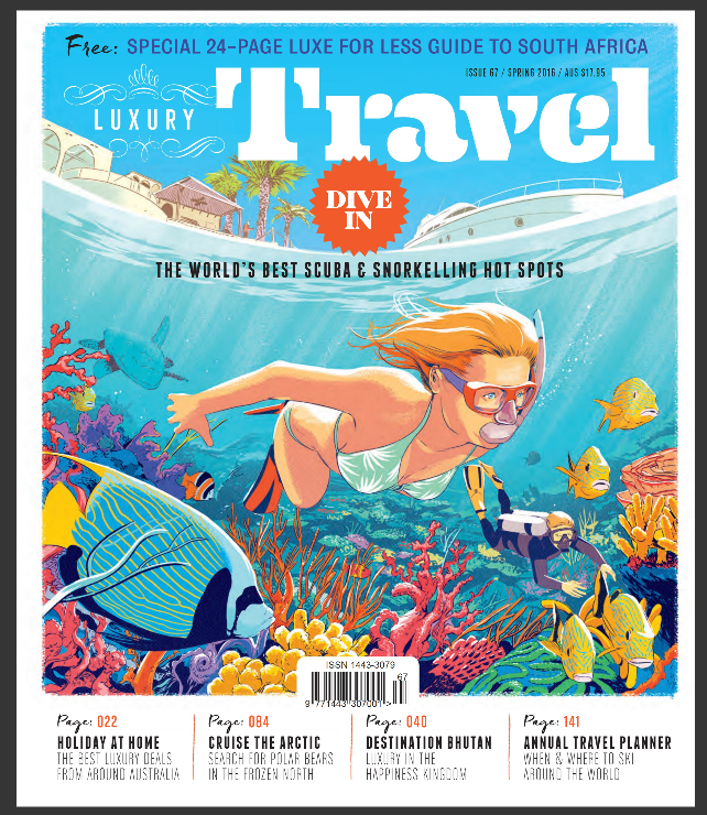
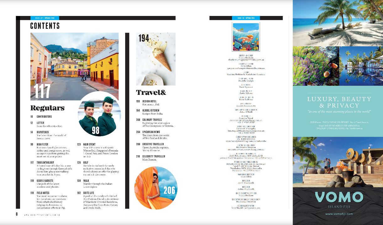
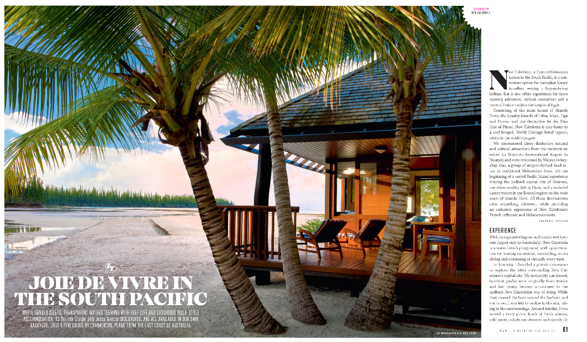
This is a travel magazine targeting children and parents in the middle class to make them want to travel. I like how the cover of this magazine is designed in a cartoon style; it makes it look creative, appealing and fun to read. However, I believe this sort of style could mainly attract children; this is done so that they would ask their parents to buy it without knowing what is inside. The contents of this magazine, however; have a different theme with the cover. Some of the contents are irrelevant to the cover picture, which kind of makes me confused. In my magazine, I would avoid the mistake of having different content with the cover theme. 


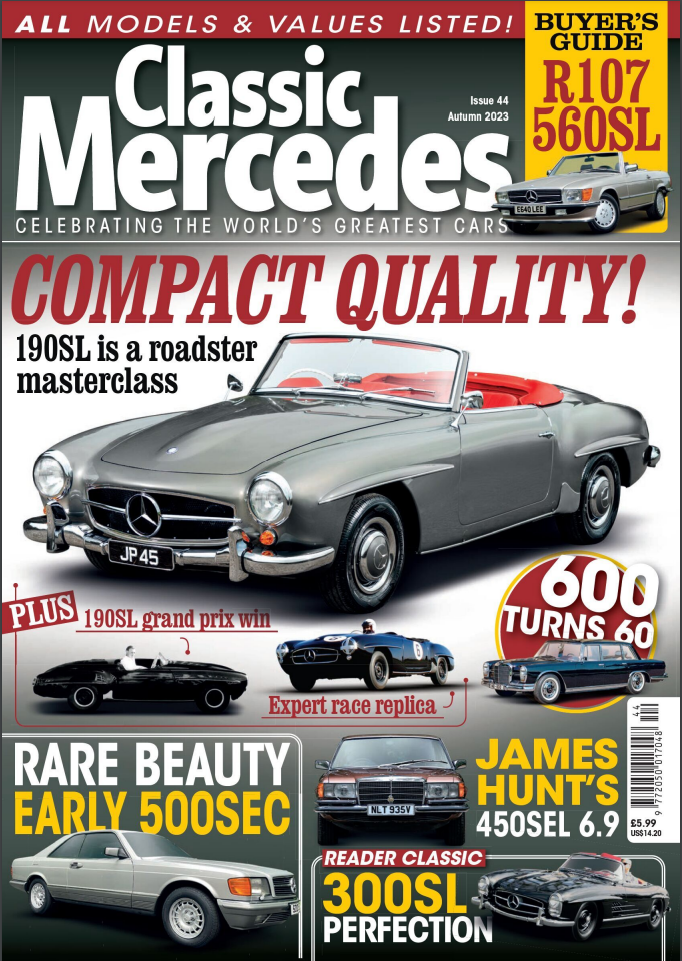
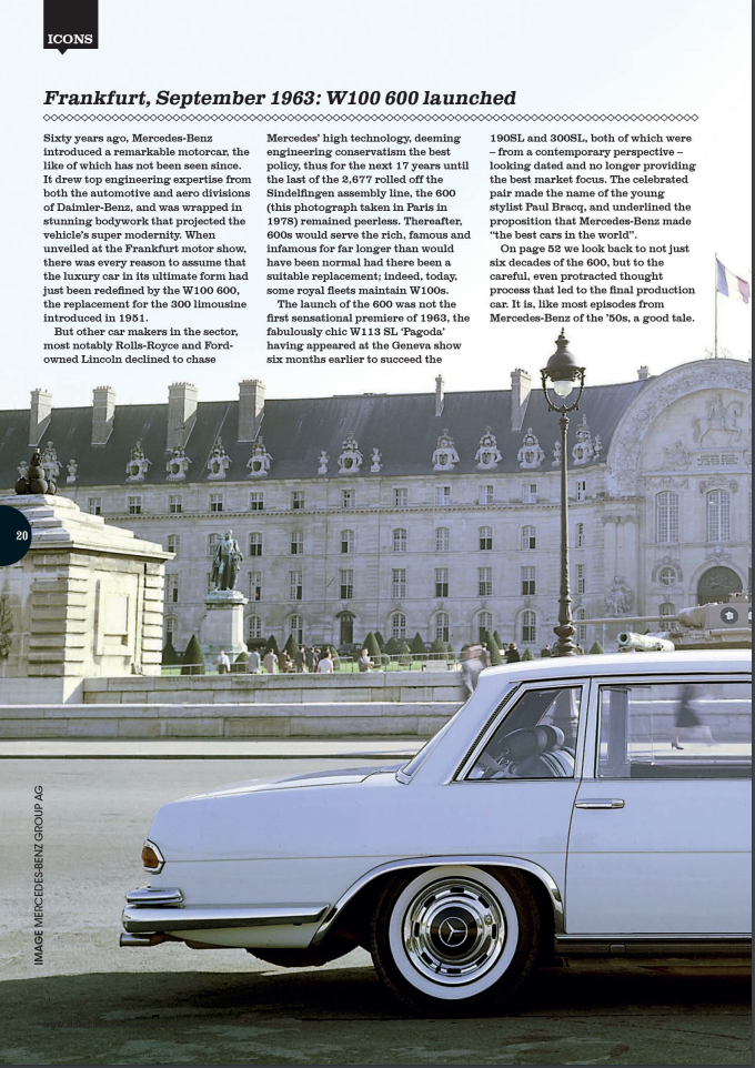
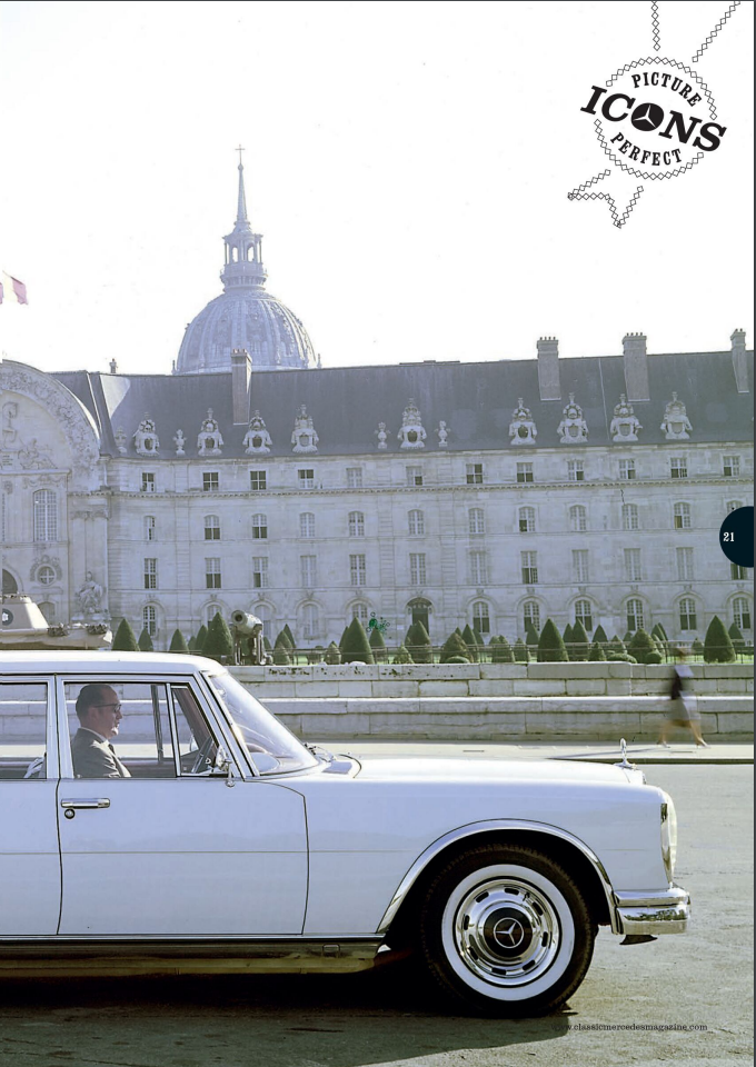
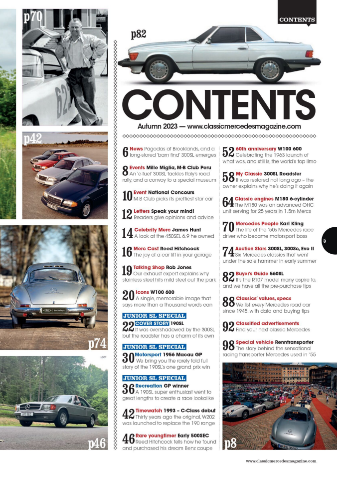
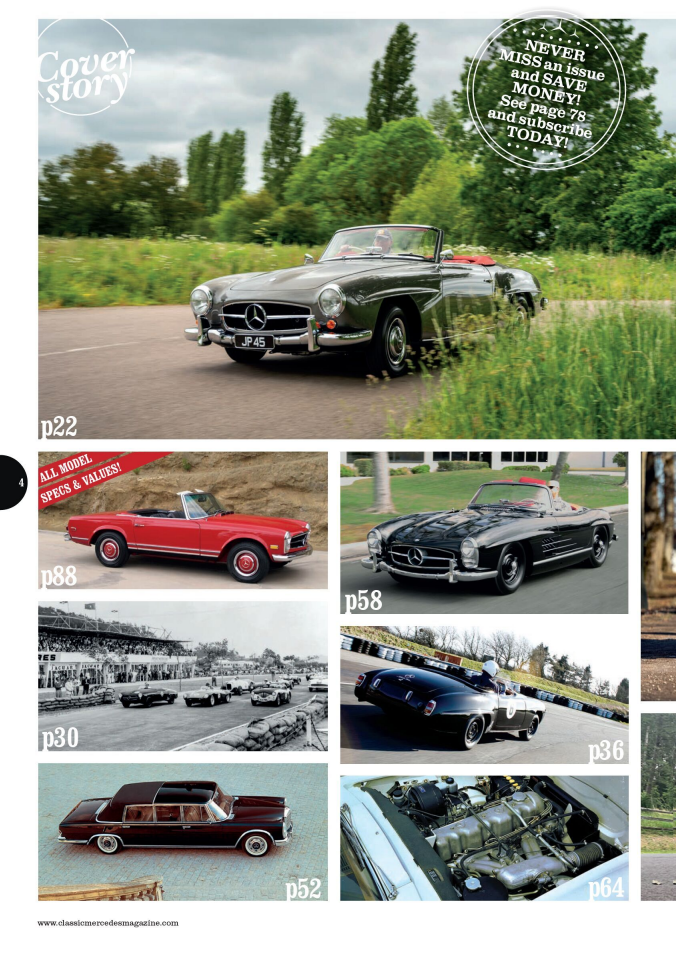
This is a vintage car magazine targeting collectors or people who enjoy these vintage cars. This magazine has a lot of images, the front cover and contents page have multiple images showing the vintage cars. Taking a quick analysis, I could see that I like how the whitespace is neatly distributed amongst all of the images and text; and I like how the double-paged spread is a neat single image where the words do not cover it up. However, I dislike how the main cover has a bit too many images; making the cover look a bit overwhelming; however, I think this cover aligns with the conventions of an automotive magazine showing lots of different kinds of cars. 


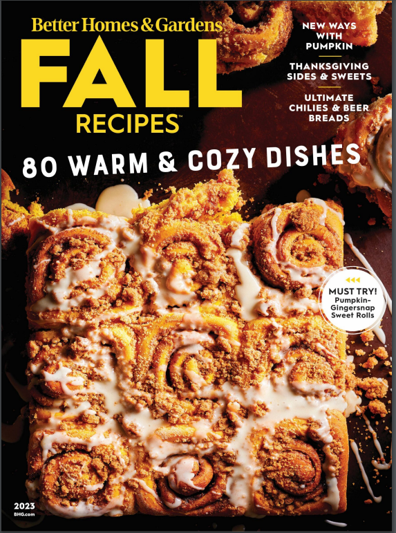
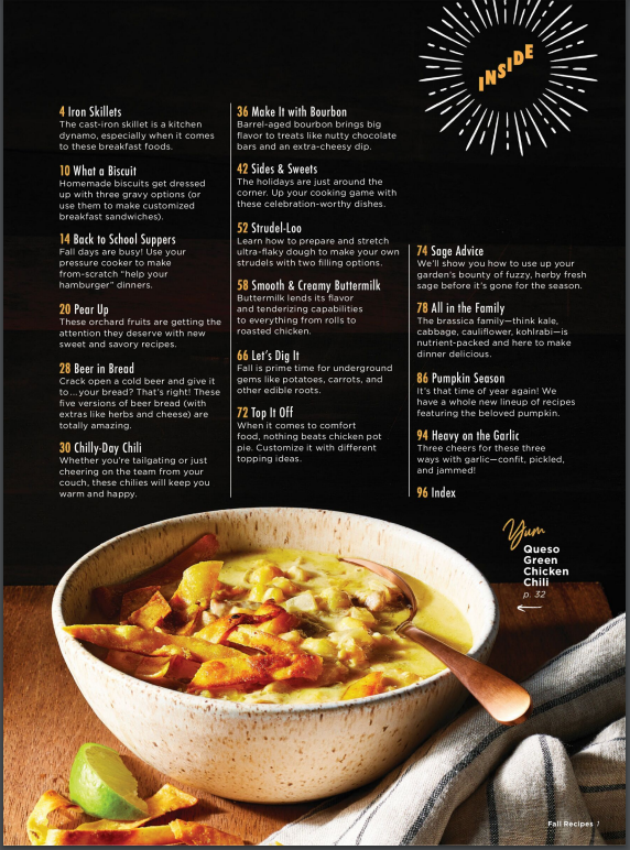
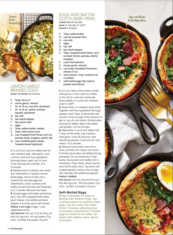
This is a cooking or culinary magazine targeting the home cooks in a household. It has a very attractive and delicious food in the cover image and I think this magazine is organized really neatly. I like how images in the double-paged spread are distributed into sections to keep it neat. This magazine seems to have a golden brown and black colour theme with a white background and it follows the theme to keep it looking eye-catching. I really like the neatness of this design and for my own magazine, I might implement a colour palette. The only thing I do not like is how the text is aligned. 


Additional Research

Here are some travel magazines as I decided to use travel as my magazine genre


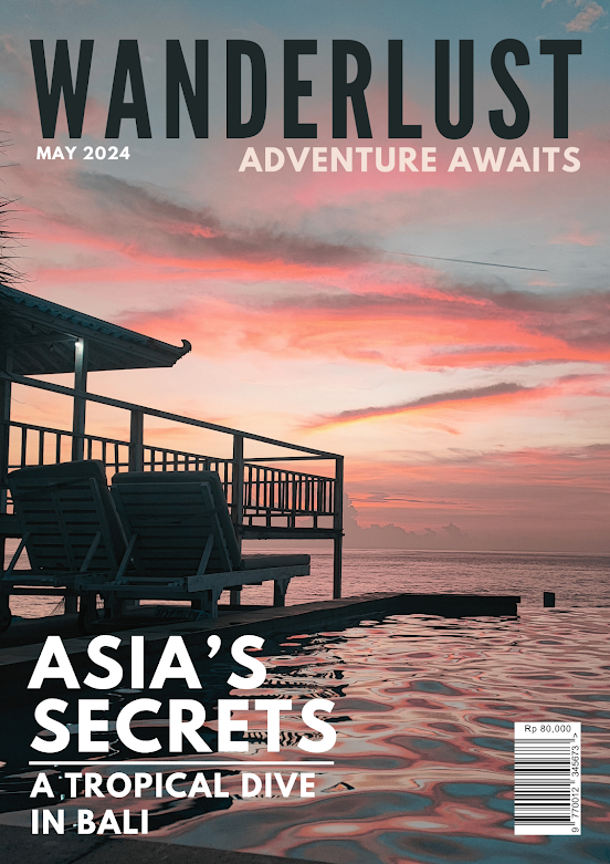
From a quick Google search, we could see that the conventions of the main covers are a single, very attractive and eye-catching main cover image with usually a large white text for the title or other text on the cover.


Mini-Reflection
I think that I would need to follow these conventions, meaning that I would need a really good camera to take these pictures. That might be a problem for me later on when designing these covers. 


This is the link to my double-paged spread research and development: 
https://adrien-regentsmedia.blogspot.com/2023/11/double-page-spread-research-developement.html 


Weekly Progress & Plan

Here is my weekly progress for the magazine project, and also my rough plan.


Week 

Term 2

Week 

Term 3

1

(2 Oct)

Brief, Research

8

( 8 Jan)

Development

2

Research

9

Shoot

3

Research

10

Shoot, Self Reflection

4

Proposal 

11

Post Production

5

Development

12

Post Production

6

Development

13

(12 Feb)

Deadline (Monday 12th February)

7

Development

14


Term 2

Week 1
- Today we were introduced to our project brief. We will be making a magazine, filled with the front page, contents and the double paged spread. I think I am going to enjoy this project as I enjoy graphic design-related projects.
-We learnt lots of new magazine terminologies, describing the use and purpose of each part of the magazine. I learnt a lot of new things, I think these terminologies are really interesting as each term describes the part of the magazine that makes it so effective. I would try to include these contents in my magazine to make it look like a typical magazine people read. 
-We also learnt narrative theory in class yesterday, I think this was the most challenging part of this week's lesson, 

Week 2
-This week we learnt about the representation theory, where media gives an object and event a meaning. Reality or the original subject has no real or definite meaning. Companies use media to choose and create meaning, and with this theory, I learnt that I need to think and choose what meaning I want the audience to get from my magazine
-This week we researched the big covers for our magazine;

Week 3
- I started changing my format for the weekly progress so that it would show my work more clearly; and the challenges and solutions I faced and made to achieve this work. 
- I analyzed 2 magazine covers in detail today; the magazines were Travel and Architecture. I really liked how these covers looked really neat; where the images are the most dominant. The cover images for both travel and architecture look very clean; where there was not much text. I would follow these conventions for my travel magazine. 
-I started making my Statement of Intent; which was the brief idea for our magazine. I plan to write a magazine about travel.
Problem: 
Solution:
To-do: I need to finish 4 more research on 4 more magazines, and I'll need to do this in my free time. 

Week 4
-We started working on development for our magazine - planning and thinking of 10 possible titles, 10 cover lines, 10 images and our initial content for our magazine. 
-We started learning about genre theory which states that media should be similar enough so that it could be recognized as a genre; but different so that the content is exciting. I would apply this theory in my magazine; I would try to make my magazine different to others so that it would remain interesting. 
Problem: I struggled with thinking of titles, cover lines and images that suit my magazine. I think I lack in being creative for coming up with these.
Solution: I talked with my group and teacher, and they helped me think of possible titles that would suit my magazine. I think I would need to research more magazines and think of more cover lines and images. 
To-do: 
- need to research more of the cover lines. 
- would need to finish describing my double-page spread. 

Week 5
- This week we did a theory lesson where we did a gallery walk on key media theories. I think this lesson helped me understand the theories more and I think one of the theories which was the representation theory could help me in my magazine production. 
- We researched a double-page spread that has the same category as the genre of the magazine we are making. We looked into the article and analysed the content. 
Problem: I did not finish researching 2 double page spreads in time
Solution:  I need to work faster on researching.
To-do: Finish 1 more double-paged spread research

Week 6
- This week we finished our double-paged spread research so that we could start our article for our double-paged spread. I think finalizing my idea for my article was the most challenging part of this week.
- We learnt the differences between new and old media and I learned how magazines have changed over time, I think that we should adapt to the new changes so that our magazine could be more effective or realistic.
- I researched an author's writing style and his articles so that I could match his style and use the author's name as the article writer so that the audience would believe and relate to it.
Problem: I need to pay for the author's  articles, not allowing me to see the full article
Solution: I looked up how to bypass these firewalls online from a website that teaches me how to do so, the YouTube video expanded my technical skills for research. 
To-do: I think I'll need to finish the article draft over the weekend

Week 7
- This week we started completing all the missing work and also refining our blogs that aren't that good or done. I also added a reflection for most of my blogs.
- This week is the last week for any project lessons in term 2, and I will need to finish any more work over the holidays. 
- We were given a task to scout locations for taking pictures of our cover and double-page spread. 
Problem: 
Solution:
To-do:

End of Tern Reflection


Reflection
With the help of this weekly progress blog and the table checklist given to me by our teacher, I could note down the tasks I have completed and the tasks I will need to do, helping me remember and finish my tasks later on. Looking at my weekly progress also showed me my improvements and progress throughout the project, making me feel more confident in my work. Overall I think this progress recorder really helps me to complete and reflect on my work. At the end of this term, I still have a task to do over the holidays which is just taking pictures of possible locations I might use for my magazines. I will continue to use this method to track my progress because it brings me a lot of benefits. 


TERM 3

Week 1
- Our teacher gave us some feedbacks 
- Risk Assesment

Week 3
Problem
Solution:
To-do:

Week 2
-Today we explored and experimented with how to make and layout magazine covers. We made drawings to plan an experimental magazine cover, and we tried to edit and play around with the layouts of these covers in a google draw our teacher gave us. I liked my drawings but I had problems thinking of a good way to layout the covers. We then took pictures around our school to try and design a magazine cover and try a different layout.
Problem: Taking pictures for our experimental magazine was difficult, the camera was bad and I didn't have a proper location.
Solutions: 
To-do:

Week 3
Today we started designing the main cover drafts from our sketches and tried to experiment with the different design layouts. I had multiple ideas and throughout the lesson I enjoyed trying to experiment with all the possible different combinations. 
Problem I needed to finalise my title for my magazine but the good titles were all taken.
It was hard for me to find the layout I liked 
Solution:
To-do:

Week 4
Today we started doing our critical self-reflection, where we reflect on the work and the self-improvement we had throughout our project. I reflect on my work so far; thinking about
Problem
Solution:
To-do:

Week 5
This week I researched the best software for editing our magazines, and Adobe Indesign is the most used and useful for designing magazines. I downloaded the software and tried experimenting and learning how to use it.
Problem: I find it really hard to understand how to use this software because it is my first time using it
Solution: I searched for a YouTube tutorial on how to get started with this software.
https://youtu.be/0eqhUFRlvgI?si=zRMtxAh-PwvdUX4i 
To-do:


Week 6
Problem: Our class time was cut by an hour on the last day, so I didn't have enough time to do my double-spread 
Solution: I will need to do the double paged spread at home
To-do: 
- Finish designing the contents page; double spread and front cover; along with all the research and developments for each section. 


Component 1 - Brief

 Here is the brief for Component 1. I have decided to choose the magazine option.


Reflection
After taking a look and understanding the brief, I am excited and interested in designing my magazine and also learning the theories that would be important to learn for my magazine. I have a feeling that the time in class would not be enough to finish all my work so I will need to manage my time more effectively at home. I'm having a hard time thinking of the rough idea for my project - I might need to look at more magazines to give me an idea of what to make. Overall, I'm looking forward to doing my best in this project. 

Final Magazine

This is my final magazine design Front Cover Contents Page Double-Paged Spread Here is the published web version of this magazine.  https://...