Thursday, 22 February 2024

Final Magazine

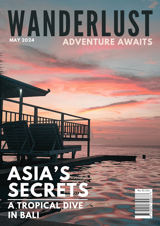
This is my final magazine design
Front Cover


Contents Page


Double-Paged Spread


Here is the published web version of this magazine. 
https://issuu.com/neils.adrien/docs/final_magazine_1_


Wednesday, 21 February 2024

Monday, 19 February 2024

Contents Page Research + Development

Contents Page Research 

 These are some content pages of a travel magazine. 


Images
Contents pages in travel magazines usually feature multiple locations of different locations that will be featured in the magazine. These images are usually long-shot aesthetic images and are aesthetically pleasing.

White Spacing
The contents pages in travel magazines always use white borders effectively, so that the image becomes the main subject; not the text. Most magazines use this type of layout to be able to contrast with the text. However, a lot of different content pages also use no white spacing as they wanted to show the full image that they have captured. 


Development 

Here is the development process for my content page. 


Here are some sketches for my content pages 


I liked the first and fourth designs so I will try to digitalize them both.
                   1                                                            2


I decided to develop the second one as it fits into the conventions that I have researched; where the contents pages usually contain multiple different images of the locations they are showcasing. Furthermore, the white spacing in the right contents pages also conforms to the conventions making it look more recognised as a travel magazine.

2


Here I changed the alignment of the text making it justified. This makes the overall viewing text and images neater.


3


A friend suggested that I connect the horizon/skyline to the images next to it so that it would have an effect of 1 singular image or that these images connect with each other. This effect looks better than the previous one as the images are arranged more neatly. 


Here are more different layouts i tried with different combinations of titles, typography and spacing. On the very right I have also added the magazine name with the issue date at the bottom left. This is a great way to add more content to the empty space below. 


I added a line at the bottom that further uses up the empty space so that the contents page looks less empty 


This is my final content page result: 


Reflection
Overall I think I made my content page minimalist but still followed the conventions of travel magazines. I really liked my final outcome for the contents page, as it does not follow the usual square pictures. The hardest part of designing the contents page was to think of ways to put multiple images without making the layout boring. 


Sunday, 18 February 2024

Front Cover Research + Development

Front Cover Research 

 These are some front covers of a travel magazine. 


Main Image
The main covers of travel magazines are usually singular high-quality and visually appealing images that catch the audience's attention. These images are usually landmarks or beautiful sceneries of the locations the travel magazine will discuss in its contents. 

Main Typography 
The typography used for travel magazines varies as the travel magazines can use both serifs and san serifs depending on what effect they want to have on the audience. However, one thing that is common for the magazines is that they all have a bolded magazine name to capture attention. Furthermore, the colour of the title on the cover is usually white or black depending, on the background image. The colour should stand out from the image to be able to be seen clearly. 

Layout
The main covers of travel magazines usually have their images taking up all the space on the page; however, most magazines also use whitespace to keep the design neat and clean as the space could contrast with the image that has a lot of elements acting on it. 


Development 

Here is the development process for my front cover.

Trying a New Software

I tried using Adobe Indesign to design my magazine covers, as my research and teacher told me that it is the main software magazine designers use. 

This will be my first time using Adobe Indesign and I am relatively new to this software. Adobe Indesign has lots of precise tools that help design magazines, and it might allow me to design better-quality magazines. 


Here is my first attempt at trying to design with this software.

Mini-Reflection
When trying out Adobe Indesign, I had a lot of struggle with designing specific elements I wanted for my front cover. Despite, watching numerous tutorials online on YouTube and other websites; I still struggled with this software as I am not used to it. I did not like the amount of precision and time it took for me to edit elements on the cover. Because of the limited amount of time I have, I will be using Canva to design my future magazine covers, so that I can work more efficiently and quickly.

Below are my sketches for my magazine cover 
I like the top and bottom right design most so I will recreate it digitally. 

(if image is blur : 
https://docs.google.com/drawings/d/1URi1BgUQO-xqZd-V4Nd-ZVB2Re35bJw_NRnxD9ZbfAc/edit?usp=sharing (zoom in) )


Final Magazine

This is my final magazine design Front Cover Contents Page Double-Paged Spread Here is the published web version of this magazine.  https://...