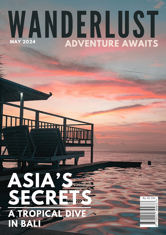
Front Cover Research
These are some front covers of a travel magazine.
Main Image
The main covers of travel magazines are usually singular high-quality and visually appealing images that catch the audience's attention. These images are usually landmarks or beautiful sceneries of the locations the travel magazine will discuss in its contents.
Main Typography
The typography used for travel magazines varies as the travel magazines can use both serifs and san serifs depending on what effect they want to have on the audience. However, one thing that is common for the magazines is that they all have a bolded magazine name to capture attention. Furthermore, the colour of the title on the cover is usually white or black depending, on the background image. The colour should stand out from the image to be able to be seen clearly.
Layout
The main covers of travel magazines usually have their images taking up all the space on the page; however, most magazines also use whitespace to keep the design neat and clean as the space could contrast with the image that has a lot of elements acting on it.
Development
Here is the development process for my front cover.
Trying a New Software
I tried using Adobe Indesign to design my magazine covers, as my research and teacher told me that it is the main software magazine designers use.
This will be my first time using Adobe Indesign and I am relatively new to this software. Adobe Indesign has lots of precise tools that help design magazines, and it might allow me to design better-quality magazines.
I like the top and bottom right design most so I will recreate it digitally.
(if image is blur :
https://docs.google.com/drawings/d/1URi1BgUQO-xqZd-V4Nd-ZVB2Re35bJw_NRnxD9ZbfAc/edit?usp=sharing (zoom in) )


No comments:
Post a Comment