Wednesday, 17 January 2024

Magazine Layout Tutorial


 In this post, I will demonstrate some basic design skills that I learned in class


Task 1 

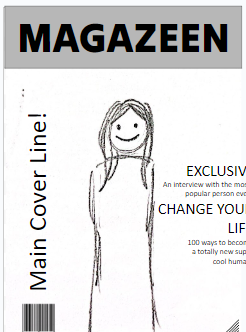
My teacher told me to start sketching a minimum of 5 layouts for my front cover magazine in 5 minutes. Here are my sketch results.

Mini-Reflection
Doing these sketches was very hard for me as I was pressured to make multiple designs in such a short amount of time. However, I find it really fun drawing my ideas onto paper. My teacher told me that making any design whether it is a magazine or other things should be done on paper first to give us a general vision of what we want. I think this activity has helped me understand the first steps of designing things. 


Task 2

Next, my teacher gave the class a layout template to experiment with different layouts. I was given 10 minutes to arrange these elements to make multiple covers. Below is the template that I was given. 


Here are my results: 


Mini-Reflection
I find this task also very challenging due to the time given to designing these template covers. I struggled with the layout as I could not create the layouts that I liked or envisioned. I think I will need to do more practice with this layout. Despite that, I think I still find experimenting with the different layouts fun - I am exploring different ways to design each element of the magazine. 


Task 3

After completing task 2, my teacher explained to the class the 4 fundamentals of designing magazines. This includes Borders, Hierarchy of type, Typeface and Colour.  

Borders on a magazine are guides that mark where everything should stay on the page. Text, images, and other stuff shouldn't go past these lines. They need to be lined up properly with the borders to keep things organized, avoid looking messy, and make the magazine look more professional.

The hierarchy of type is about how we arrange text so that it's easy for people to read. We do this by adjusting the position of important text, like the title and main headline, based on how important they are. This helps readers quickly find the most important information and continue to the next. The most important information usually stands out

A typeface is a specific style of writing used in text, and it's a crucial part of a magazine's visual identity. It affects the magazine's personality and how easy it is to read. much more than the rest. It is usually mixed with fonts, as fonts are the different types of typefaces such as bold italics etc. 

Colour choices in the magazine also play a key role in the visual aspects of magazines. Different colours paired with each other can evoke different aesthetics, moods or feelings. Colour plays a crucial part in the audience's attention to magazines. 

With this knowledge, our teacher told us to improve on the covers that we made.


Here is one of my Final Results


Reflection
This final task was my favourite part of the design process as it is where the design starts to come together. The final results for these templates turned out great. I find it much easier to experiment with the different colours, fonts and borders instead of making a new magazine from scratch. I learnt a lot of fundamentals and key things to consider when designing magazines. Overall I think this exercise will be really helpful for designing my future magazine pages. 


Wednesday, 10 January 2024

Location Scout + Risk Assesment


Here are the locations for my magazine pictures I found over the holiday and the potential hazards they may cause. 


Reflection
Analysing my locations helped me and made it easier to decide how to take the angles, time and views of the locations. The risk assessment analysis also opened my eyes to the possible amount of hazards there might be when taking the photoshoot. With the knowledge from this risk assessment, I can and will be able to be more cautious when taking photos. Identifying risks will also help me limit the amount of errors that might happen during my photoshoot. I really enjoyed this analysis activity as it made me think creatively about the different risks that might happen. 


Location 1:

Ocean Cliffside (Nusa Lembongan - Devils Tear)


Location Assessment
This ocean cliffside is located in Nusa Lembongan, a small island near Bali. The place has no name but it is well known for the Devil's Tear; which is where the ocean waves crash the cliffside, causing the ocean water to spray all over the cliff, a very incredible view to see.  

Purpose of the shoot: 

-High-quality images for the front cover
Media Language:
- Light blue ocean and sky, connoting a very calm and relaxing atmosphere which may comfort the viewer to want to look into more of the magazines. 
-Long shot, portrait to show the viewer the beauty of the location all around when they visit the area
-Brown and Beige cliff that works well with the colour of the blue oceans 
Pros: 
-Natural ocean beauty, attracts audiences that need a break from the boring, urban city atmosphere. 
-The Location is about 3 hours from where I live, including the time for the required boat to visit the Nusa Lembongan island. The accessibility helps me with being able to take the photo shoot within a day (also follows the routes of other places below)
-Very open area, giving me lots of potential to take angles of the picture 
Cons:
-Very Crowded, filled with lots of tourists at noon
-Unexpected waves, making it harder to take the photos and may take a long time to get the perfect moment for the picture 
Alternative Location: 
-Devil's Tear in Klungkung or Jungutbatu (both in Bali), Nusa Penida (a neighbouring island)

Risk Assessment
Potential Hazards and their Evaluation : 
-Unexpected weather
        Rain may cause equipment damage on cameras, phones and drones

-Slippery landscape + Sharp Rocks.
        Mist from the Devil's Tear may cause the rocks or soil to be slippery which may lead to slips and hurt ourselves. The sharp rocks in the area make it an even greater danger when slipping on the area. Sharp rocks could cause harm ranging from cuts and bruises to broken bones

-Animals in the area
        There are lots of bugs, snakes and other wild animals in the area which may be venomous

-Natural Disasters
        Earthquakes and Tsunamis could be a very dangerous natural event that could happen anytime. The photo shoot is near the sea making it more prone and dangerous to Tsunamis.

Control Measures:
-Unexpected weather
       Check for weather forecasts to know if it will rain

-Slippery landscape + Sharp Rock
      Be more careful when walking and stepping around the area. Make every step a cautious and careful;

-Animals in the area 
      Understand the local faunas and the threats they may impose, be more aware of our surroundings 

-Natural Disasters
      Learn and Practice earthquake and tsunami procedures. For tsunamis, travel to higher grounds immediately within a warning of a potential tsunami.

Implementation Timeframe:
The photo shoot will be on Sunday, 14th of January 2024.
- Checking weather forecast: 1 day before the photoshoot 
- Researching local faunas: within the week of the photoshoot 
- Natural disaster drills: 1 day before the photoshoot

Location 2

Sandy beach (Nusa Lembongan)

Mushroom Bay


Location Assessment
These are beaches I found on the island of Nusa Lembongan. These beaches have a great balanced scenery of the sky and the ocean. The great views of the beaches here also inspired me to design this travel magazine. 

Purpose of the shoot: 

-High-quality images for the front cover and double-page spread. 
Media Language:
- Light blue ocean and sky, connoting a very calm and relaxing atmosphere which may comfort the viewer to want to look into more of the magazines. 
- Daytime to show the crystal clear ocean waters that make the beach look more visually appealing
- Sunsets to make a more relaxed beautiful atmosphere. Also works well with the title of wanderlust, as viewing a sunset also gives the sense of adventure - aligning with the name wanderlust.
Pros: 
-Follows the same route as the previous location (Ocean Cliffside) allowing me to access and take lots of pictures within a day
-Very open area, giving me lots of potential to take angles of the picture 
-The photoshoot session could be at any time, it is flexible as beach photos will look good from sunrise until sunset
Cons:
-Very Crowded, the beach is filled with lots of tourists at noon and may obstruct the photoshoot
-Heat in the morning until noon may be intense causing it to be very tiring to do the photoshoot 
Alternative Location: 
-Sanur Beach, Kuta Beach, Nusa Penida Beaches

Risk Assessment
Potential Hazards and their Evaluation : 
-Unexpected weather
        Rain may cause equipment damage on cameras, phones and drones and seawater could damage equipment. 

-Sandy wind
       Windy beaches paired with sand could be harmful to our eyes as the sand may get stuck in our eyes. The drone equipment may also contribute to this issue, where sand might hit our eyes, 

-Sensitive Skin
       My skin gets really irritated after about 20 minutes of exposure to the sunlight, especially when the sun is high from noon to afternoon.

-Security
       Bringing lots of equipment such as drones and cameras is expensive and it might be stolen by people if not stored properly. 
Control Measures:
-Unexpected weather
       Check for weather forecasts to know if it will rain for the upcoming photoshoot

-Sandy wind
      Bring sunglasses to help protect eyes from debris in the air, and help prevent eyes from being hurt by direct sunlight. 

-Sensitive Skin
      I will be wearing long sleeves and long pants to protect my whole body from the sunlight. It may not be comfortable due to sweat and heat but it will help protect me for this photoshoot 

-Security.
      I will need to keep a close eye on my equipment and make sure that I bring everything with me before I leave the location. 

Implementation Timeframe:
The photo shoot will be on Sunday, 14th of January 2024.
- Checking weather forecast: 1 day before the photoshoot 
- Sandy Wind & Sensitive Skin: Prepare to bring sunglasses and long clothes and pants 1 day before the photoshoot. 

Location 3
Monkey Forest (Ubud)


Location Assessment
I can have a picture of a monkey be the main subject for the magazine cover. This image of the monkey may attract the audience to view it out of curiosity or cuteness.

Media Language:
-Monkeys lying down connotes a feeling of playfulness indicating that the magazine will have a similar emotion through the contents
Pros: 
-Close to my home, about a 1-hour drive to this location
-The audience may find the monkey adorable, capturing their attention to purchase the magazine
-Lots of natural flora, showing the luxurious lush greenery of the location - promoting more of Bali's natural beauty 
Cons:
-Unable to control the poses of the monkeys, it is uncertain how they will act or pose
-The location of the photoshoot does not look appealing
-The employees or rules and regulations of the park might not allow the photoshoot with monkeys without a permit
Alternative Location:
-Forests in Bedugul/Ubud


Risk Assessment
Potential Hazards and their Evaluation :
- Monkeys may attack
      Monkeys under stress or provocation of food may bite and fight with us humans. This could lead to potential harm to these animals. 

-Diseases 
     Virus diseases monkeys carry may be able to be passed to us humans; causing us to feel sick and unable to continue the photoshoot
Control Measures:
-Monkey Attacks: Do not bring food near these monkeys, and be cautious when taking pictures of them 
-Diseases: Take vitamins and exercise to keep a fit immune system so we don't contract these viruses. 
Implementation Timeframe:
- Intake of probiotics and vitamins: Daily 


Mountain Views (in Bedugul)


Friday, 17 November 2023

Magazine Article First Draft


Here is my first draft for my article magazine


Research and planning in this document: 

https://docs.google.com/document/d/1VrmsKYCFxUH0Qe93Kyh-7F1DphFHZ9nVz4-_8wYcVq0/edit?usp=sharing


My first draft for my articles is done and I think that these 2 stories might be enough for my double-page spread idea? I think I might need to think about that more. I somehow really enjoyed making this article, maybe because it was based on my past experiences. What I find difficult here is trying to use the author's voice as in using their writing style. I needed to keep referencing my article back to his work to make sure I used the right words if he were to write it. I think in the future I might make significant changes to match the images and content I would like to put in the magazine.


Japan’s Fun Adventures

An Adventure into the Movies

A Must-Visit in Osaka ←picked


Post-pandemic in early autumn 2022, I spent about two weeks in the middle of Japan’s city of Osaka with my family. On the second day of our stay, my grandchildren really wanted to visit Universal Studios Japan (USJ) as it was her first time coming to this country. That morning we got ready, booked our tickets and utilized the Osaka Train Loop Line to quickly reach our destination. Japan’s highly effective train system allowed us to reach USJ within just 7 minutes.


Upon arriving at the Universal Studios train station, we got out to the platform, and the entire place was swarmed by people wanting to have fun. Teenagers, adults and even an entire school of toddlers came here to enjoy a Friday. The locals were all dressed in costumes and merchandise from USJ and lots of people wore bright colours that matched with their friends. The station was fully covered with them, and people from Japan were really fast walkers - we reached the back end of the crowd - but getting into the theme park was very quick with Japan’s modern and efficient technology. 


Entering the gates to USJ was really stressful as there was just so much to try. We were all confused about where to go first - so my family decided to split up so we could try everything! The theme park featured attractions and themed locations from famous Universal Studios movies like Harry Potter, Spiderman, Jurassic World and so much more.  


My granddaughter really enjoyed the Harry Potter section of the theme park, and honestly, I agree. This area of the theme park was as if Hogwarts came out of the movie itself - replicated just like how it was shown in the movie. We get to actually go into the castle while queuing in line, and the interiors of the castle have incredible, precise details that match what we see on screen. The food there was also really delicious, and the food in movies was somehow replicated - one of my personal recommendations is the butterbeer in Harry Potter. 


We spent the whole day there and it was really worth it. We tried all sorts of immersive experiences and exciting rides that aligned with movie themes - it was as if we experienced these movies for ourselves. The whole day we also looked out for shows and parades that were all filled with enjoyment. Also, make sure to stay until nightfall as the whole theme park has a different atmosphere; all the lights and signs really made the park feel more magical. 


However we had one major problem though, what troubles us is the queuing time for the attractions. The large amount of people meant that we could wait for up to two whole hours for just a single ride and it was just really inconvenient waiting for these lines. In the middle of the day, we were tired of waiting and just went to buy the express pass to skip the annoying waiting times. 


In the end, our day in USJ was just unforgettable. All the rides and sightseeing accompanied by delicious food made this trip to Osaka so much fun, it was worth a day. We bought so much merchandise here just so we could remember to come back. If you’re ever planning a trip to Osaka or Japan; you must come here to Universal Studios - you will definitely make lots of memories here.


Mini Article - Food Diary?


In Dottonburi, we visited some of the most delicious restaurants here in Osaka. We visited a well-known sushi restaurant called Sushizanmai where we ordered a Blue-Fin Tuna Sashimi. 


Eating here made my first sashimi experience unforgettable. They served really good, fresh fish accompanied by freshly grated, savoury wasabi. I would really recommend this place for trying out sashimi. 


Dottonburi also offered many different types of delicious sweet and savoury snacks like the mozzarella 10 yen pancake, melon bread ice scream and roasted king crab. 


Don’t bother eating a full-course meal when there's so much different food like this to eat! There were too many things to try and we could only eat so little! I think I might need to come back here to eat some more local dishes. 


Post Edit The article I have prepared does not align with my photoshoot plans for the double-page spread. I have made a new article for the new content of my double-page spread. I am making this decision due to my Japan pictures not being enough for the double-paged spread; therefore I have remade the article.


Here is my new magazine article


Reflection My second article draft is finished and I think this article will not fit with my magazine-themed Indonesia. Creating an article the second time took lots of my time and I feel very exhausted doing it. Writing it, however, was a little easier as I chose to use a 3rd person so that I could have written it without the voice of an author. The ideas for writing this article were also easier to gather as I have also used my own personal experiences for the content inside the article.


Nestled amidst the azure waters of Bali, a small island sits atop vibrant reefs, pristine beaches & rich local culture. A land which offers a peaceful getaway, a pocket of tranquillity away from the busy bustling of mainland Bali & the fast-moving world. Nusa Lembongan provides people with a chance to be further embraced by nature. In Lembongan, you can truly experience a hidden patch of pure nature, where the Manta rays fly & the fish swim unbothered by human activities, a hidden gem of Bali, a versatile place where you can relax or get a rush of adrenaline, it is a place to create memories that can last a lifetime.


Well, if you’re ready to experience a wonder that shelters itself under the surface of the water, then grab your snorkels or diving gear and dive straight down to the glassy waters of Nusa Lembongan’s surrounding seas, swim with the glittering fishes, graceful mantas or even the infamous mola-mola fish at kaleidoscopic coral gardens besides that, you could even catch a rare glimpse of elusive marine life! In places like the right outside the northwestern coast of Lembongan, you can really see the true biodiversity of the island, and just the pure amount of sights you can see in that one location surely gives plenty of reasons for snorkelers & divers alike to go take a dip, but maybe you’re not a seasoned diver and have never even touched a snorkel, many many helpful experienced locals have spent their lives by the Lembongan sea, so there are many stores and specialized instructor services by the coast where you can grasp the basics and take in the view of the blue landscape. Apart from that, if you do want to go diving or snorkelling but bringing the gear might be too much of a hassle, there are countless rental shops ready to lend high-quality gear for you to experience the ocean.


Maybe the side of the ocean under its surface is not for you and you want to seek some thrill & action, well have no worries as Lembongan isn’t known as a surfer’s paradise for no reason and that’s no small feat as mainland Bali is directly next to it. In fact, Lembongan even has an iconic named wave tied to the area, the iconic shipwrecks wave, a long right-hander wave perfect for a killer time with your board. However, if you’re no surf expert but want to learn how Lembongan is also a great place to start learning as you can take classes or get some general guidance from reputable instructors who have known the area & the waves for a long time, and maybe they might let you in on a local secret or something, who knows?. Other than that, if surfing isn’t up your alley, then there are a plethora of water sports services on the island, whether it’d be for some simple kayaking or jet skiing, that’s not to mention you can always visit Bali or neighbouring Nusa Penida to do some activities there like paragliding and other extreme water sports.


Even if you’re not trying to chase adrenaline or step into a deep nature trance, you can also just enjoy the unique and complex culture of Bali & Lembongan. Immerse yourself in the culture by watching truly authentic traditional performances & ceremonies or even savouring the delicious Balinese food! Lembongan has many places to observe & preserve the authentic Balinese culture. So by the time you happen to finish your daytime activities, you can embark on a culinary journey down the island’s busy night markets or beachside restaurants, with fresh ingredients straight from the source, not from any old imported ingredients. In addition to that, you can sit back & relax in one of many resorts where you can simply unwind, Lembongan has many places where you can take a leisurely stroll along the tranquil coast or try out different wellness rituals to help yourself find your inner peace.


So, it can definitely be said that Lembongan’s natural beauty & thrilling seaside nature surely provide endless opportunities for adventure or relaxation. Tranquil escape, thrilling water sports or simply some cultural immersion in a special part of the world, Lembongan’s shores have lots to offer, so who knows, it might be time to start packing and leave your worries behind to embark on an exploration of an enchanting island.


Wednesday, 15 November 2023

Terminologies


Here are all the terminologies I have learned throughout the magazine project. 

From the theory lessons, I learned a lot of new terms that I could use when talking about magazines. At first, it was quite hard for me to learn, understand and remember all these terms I would rarely use. But as the lessons kept using it, I eventually understood and it made it so much easier to talk and discuss about a specific magazine element. 
  •  -Masthead: The name of the magazine, in it's typical font, on the cover/top section which gives the paper's title, price and date
  • Selling line/Strap line: The short description of the 'identity' of the magazine under the masthead. In other words, the memorable phrase that is associated with the magazine
  • Main image: The image which fills the cover - a model, celebrity, animal, artefact or the dominant image on the cover
  • Coverlines: 'Teasers' for the contents of the magazine on the cover, or the titles of stories featured in the magazine
  • Typography/Font: The shape, style, size and colour of the letters used
  • Drop cap: The enlarged initial letter of the first word of an article - an aesthetic feature which is designed to engage the reader
  • Pull quotes: Enlarged quotes from an article - these may be included in cover lines, but are also used in the body of the article to break up the page and to attract the attention of the reader. In other words, a quote taken from the article, with the font or size colour changed 
  • Byline: The name of the writer or author of the article, usually found at the beginning. Simply, it is the 'line' which tells you who the article is by
  • Main cover line: The most important article featured, it grabs the audience's attention (featured article)
  • Barcode: Used for retailers
  • Skyline: A list of keywords featured at the top of the cover
  • Thirds: The upper and left third
  • -Prop: An image of an item
  • Puff/Boxout: A smaller image or text to stand out from the rest of the information (puff = circle, boxout = square)
  • Buzzwords: Exclusive, free, new, special edition
  • Banner: A block of colour with information inside, usually stretches the width of the cover
  • Headline: The title of the article
  • Subheading: Additional information found beneath the headline (crosshead)
  • White space: Empty space in the spread, used to break up the content (negative space)
  • Border: Empty space around the edges 
  • Column: Standard layout of magazines
  • Spread: Pages of a magazine that should be viewed together (usually 2)
  • Caption: Information about an image
  • Mode of address: The way the magazine or article addresses the audience, it can be formal, casual or direct (for images too) 


Technical Skills


Here are the online technical skills I have learnt throughout the project due to to technical problems I faced when doing my project. 


Reflection
Throughout my project, I would have not expected to learn these types of technical skills for working on my project. I was actually really surprised at how simple some of my problems actually were when I tried fixing them with the help of these articles. Now with these new technical skills, I am able to work more efficiently without losing time on encountering problems like these. The only difficulty I had with these is that some of the websites don't give a very detailed explanation and I just needed to look at more which would actually help me. 

Problem 1: I didn't know how to embed my work into my blog posts. 
Our project required lots of PowerPoint and Google Docs that needed to be put on this blog page, but I didn't know how to, as it was my first time using this platform.

Solution: I looked up how to do this from this article. 

https://www.freetech4teachers.com/2019/08/how-to-embed-google-docs-into-your-blog.html
This solution also worked for other Google tools such as Google Sheets and Slides.

Steps: 

1. Own the document first, then share and publish it to the web. 


2. After publishing, there will be an embed section in there which will show a line of code for our document, copy that code. 


3. Click the pen icon on blogger.com and click HTML view


4. Find an empty space in the code, and paste your copied line of code, and your documents should then be embedded. 


Problem 2:  I had trouble resizing an embedded document in my blogger.com 

Solution: I looked up a discussion on how to quickly solve this problem when embedding a document. and a user comment showed me how to do it. 

https://www.quora.com/How-do-you-adjust-the-size-of-embedded-YouTube-videos-on-your-blog-posts 


1. Have your document embedded and go to HTML view. 

2. Locate where you embedded your document, in my case I found it in line 3

3. Go to the very end of the code where it reads the <iframe>


4. before these '><' symbols in the code, write this code, "witdh=(your value you want) height=(your value you want)" and after that, your embed should have the good size you desire.


Problem 3: I have to pay for articles I want to use as a quick research

Solution: I looked up this article on how to bypass paywalls 

https://www.bardeen.ai/posts/how-to-bypass-a-paywall 

I used the first method with a download of their Chrome extension which allowed me to paste my article link and view it without using my money. 


Thursday, 9 November 2023

Double Page Spread: Research + Developement


Here is my double-page spread research and development for my magazine


Reflection
My double-page spread research has helped me show my preferences and dislikes for certain designs towards the magazine. I have analysed the articles and images used in the double-paged spreads and I learnt that I need to make the reading experience the most optimum for the reader. What I mean by this is that the first impressions of how neat the text is or how attractive the images are will affect whether the reader would want to continue reading. From this research, I learnt that making my magazine would mean that I would need to be more careful in designing and writing my article. I should also try to make my article engaging for the audience as I would be writing a travel diary; so my aim would be to entertain them while also reviewing and giving my opinions about a location. 


Before Reading

Magazine:

Colours

Issue:

Date of Issue/ Issue No.: February 2018

Publisher:

 PT Visindo Agensi Tama / Agency Fish

Genre:

Travel

Images:

The double page contains 1 image which fills the entire 2 pages.

The Image is a drawing of the collection of tourist hot spots in Japan, showing these popular places: - Hogwarts (Universal Studios Japan)

- Osaka Aquarium Kaiyukan

Layout

What is the layout like? Is it heavy or light on text? Where are the page numbers? Does it have lots of negative space? Does it have a drop cap?


This article has an equal amount of text and images. It could be seen that the text doesn't cover the whole double-page spread and the image makes the spread look more lively. The text does not have columns but it has multiple texts in puff-styled sections. This text does not have negative space or a drop cap.

First impressions:

I like the cartoon-styled image featuring the landmarks of this city. It has a fun-looking style and kids would like looking at it. The text however is written in small fonts and is reserved for the parents to read. 

After Reading

Heading:

 Let's Explore Osaka

Subheading:

This article features 5 subheadings which are locations in the city.

Author:

There is no author or illustrator mentioned. 

Article:

What is the article about? What is the message?

The articles are a description of places that are tourist hot spots in Japan, Osaka. It briefly describes what it is, based on the images which were the places' iconic look. The message that the author wants the audience to receive is to come to Osaka, this city holds a lot of fun activities to do.

Mode of address:

Does it address the audience directly (you, your etc). Is the writing style formal/informal, friendly/serious? 


The text addresses the readers directly with the words 'you' and 'your' to describe the things that we will do in those locations as if we were there; this is a way to persuade them to actually come to Osaka. 

Pull Quote:

The article does not have a pull quote.

Audience:

Who is the audience for this magazine? How were they targeted?


The articles were written in 2 languages, one in English and the other in the Indonesian translation for the article, as the magazine publisher is from Indonesia. The targeted audience is global, however, it is merely focused on Indonesian people/

Impression:

What did you think of the article? Was it fun, interesting, boring? Why?


I think that the article was engaging, explaining the images being illustrated so that we would know more about the place and want to visit it. I think parents would read this instead of children because the text was written small, usually children reading would have big words so that it's easier for them, thus making parents think that they should go to these places to make their child happy.

Inspiration:

What did you learn? How can you apply it to your own magazine design?


I learnt that we should make our magazine themed with the audience that is targeted so that it would be more effective.


I also learnt that illustrations are original images, so I might draw for my magazine.


Before Reading

Magazine:

  Lionmag

Issue:

Date of Issue/ Issue No.: June - July2022

Publisher:

 Bentang Media Nusantara

Genre:

Travel

Images:

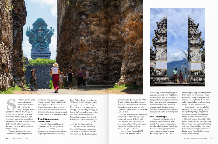
1 Big image showing a landmark in Bali, called Garuda Wisnu Kencana (The largest statue in Bali)
1 Small image next to the main image (on the right) shows another popular place in Bali which is a temple called Pura Lempuyangan

Layout

What is the layout like? Is it heavy or light on text? Where are the page numbers? Does it have lots of negative space? Does it have a drop cap?


There seems to be an adequate amount of white space between the small image and the article at the bottom, but the main image does not have negative space between the edges of the pages.


The pages seem to be heavy on text, where there is a large article below the 2 images; the layout of the text is not even through the whole page spreads but instead wraps around the image. We could also see a large drop-cap at the start of the text and the page numbers could be seen at the bottom corners of each page.

First impressions:

 The way that the text wraps around the images made it look awkward, and I do not really like it, and the layout of the images is different making it look uneven. Additionally, one of the images is much larger than the other and has no white space which is completely opposite to the other image; overall I think this layout looks kind of unusual. 

After Reading

Heading:

 There is no Heading

Subheading:

 Garuda Winsu Kencana Cultural Park, and Pura Lempyungan

Author:

No author or photographer was mentioned in the double-page spread.

Article:

The article talks about Bali being an important island in Indonesia for Indonesia's tourism industry, being one of the major factors in the economy. It then mentions and explains two of the many landmarks that could be found in this island; giving information and also describing the significance of the landmarks.


The author wants the audience to feel amazed by the landmarks, and make them want to come to Bali.

Mode of address:

The writing style for this article is very formal and does not engage with the audience. 

Pull Quote:

This article does not have pull quotes

Audience:

The audience for this magazine is Indonesians, the target audience can be clearly seen due to the language it was written in. They are targeting the Indonesian people who are looking to travel, with a medium to low budget as these places are free to visit.

Impression:

What did you think of the article? Was it fun, interesting, boring? Why?


I find this article to be quite boring as, throughout the article, it has only mentioned facts, history and the landmark's impact on the country which I think is not very fun or interesting to read.

Inspiration:

What did you learn? How can you apply it to your own magazine design?


From this double paged spread, I learnt that perhaps having one dominant image that covers the whole double paged spread would be better; and to keep the negative spacing consistent so that it doesn't look awkward. I would also try to engage with the audience with a more direct style so that the travel magazine would be much more effective.


Final Magazine

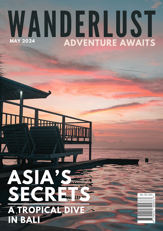
This is my final magazine design Front Cover Contents Page Double-Paged Spread Here is the published web version of this magazine.  https://...