In this post, I will demonstrate some basic design skills that I learned in class
Task 1
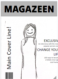
My teacher told me to start sketching a minimum of 5 layouts for my front cover magazine in 5 minutes. Here are my sketch results.
Next, my teacher gave the class a layout template to experiment with different layouts. I was given 10 minutes to arrange these elements to make multiple covers. Below is the template that I was given.
Here are my results:


Mini-Reflection
I find this task also very challenging due to the time given to designing these template covers. I struggled with the layout as I could not create the layouts that I liked or envisioned. I think I will need to do more practice with this layout. Despite that, I think I still find experimenting with the different layouts fun - I am exploring different ways to design each element of the magazine.
Task 3
After completing task 2, my teacher explained to the class the 4 fundamentals of designing magazines. This includes Borders, Hierarchy of type, Typeface and Colour.
Borders on a magazine are guides that mark where everything should stay on the page. Text, images, and other stuff shouldn't go past these lines. They need to be lined up properly with the borders to keep things organized, avoid looking messy, and make the magazine look more professional.
The hierarchy of type is about how we arrange text so that it's easy for people to read. We do this by adjusting the position of important text, like the title and main headline, based on how important they are. This helps readers quickly find the most important information and continue to the next. The most important information usually stands out
A typeface is a specific style of writing used in text, and it's a crucial part of a magazine's visual identity. It affects the magazine's personality and how easy it is to read. much more than the rest. It is usually mixed with fonts, as fonts are the different types of typefaces such as bold italics etc.
Colour choices in the magazine also play a key role in the visual aspects of magazines. Different colours paired with each other can evoke different aesthetics, moods or feelings. Colour plays a crucial part in the audience's attention to magazines.
With this knowledge, our teacher told us to improve on the covers that we made.
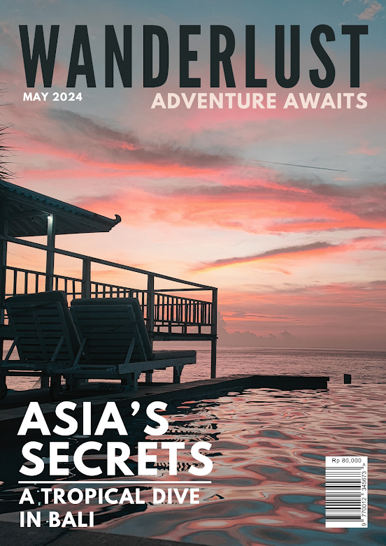
Here is one of my Final Results
Reflection
This final task was my favourite part of the design process as it is where the design starts to come together. The final results for these templates turned out great. I find it much easier to experiment with the different colours, fonts and borders instead of making a new magazine from scratch. I learnt a lot of fundamentals and key things to consider when designing magazines. Overall I think this exercise will be really helpful for designing my future magazine pages.


No comments:
Post a Comment